5 Ways To Improve The Design Of Your Website To Maximise Conversion
Our creative lead, Jess has written a short guide on how to improve the design of your website to maximise conversions.
Written by: Jess, Creative Lead
21/02/2022
3 min read

It’s easy to say that a better website has better conversion, obvious right? But what exactly is it that improves the conversion? I have been designing websites for over 9 years and believe me when I say that web design has changed drastically over this time, so here is a short guide on how to improve the design of your website to maximise conversion.
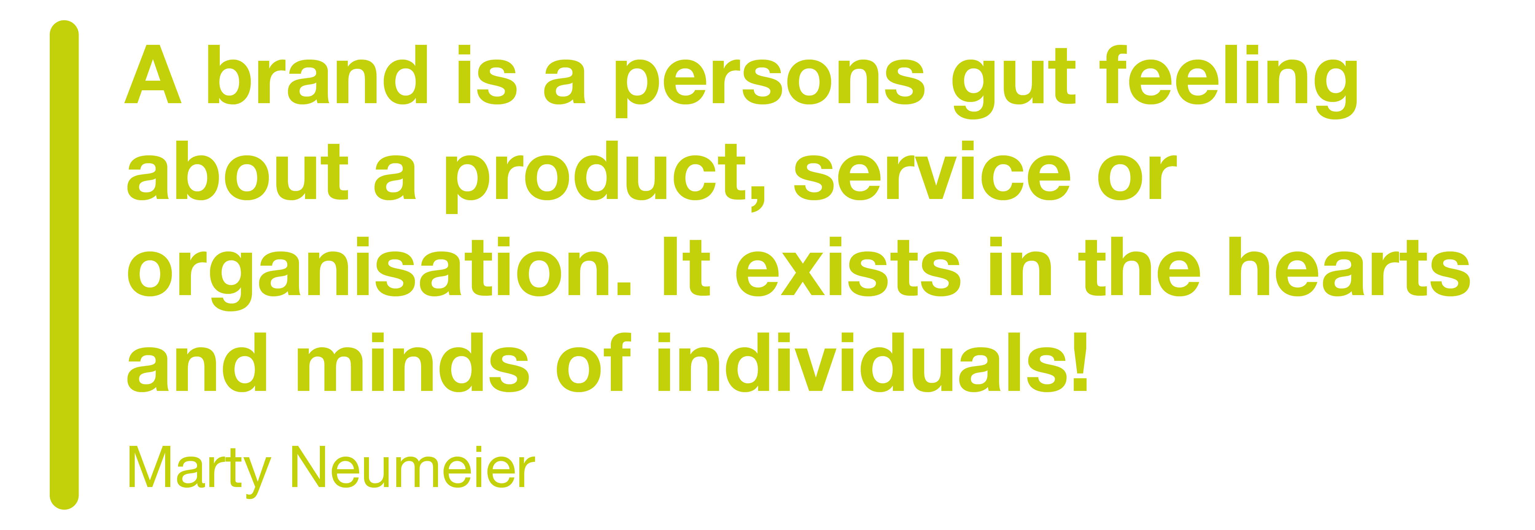
Not Just a Pretty Logo
Branding is a buzz word that a lot of people don’t know the meaning of. By saying ‘brand’ I don’t just mean a pretty logo (although this does help). A brand is how a business, product or person want to be perceived by those who interact and experience it. This includes a multitude of aspects:
Personality
Experience
Competitive Advantages
Messaging
Tone of voice
Brand Positioning
Design style
Core values
Objectives
Assets
Purpose
Emotions
Logo
Colours
Vision
Mission
Fonts
Imagery style
In short, a brand needs personality and a vision that sets the business apart from the rest, it is this that creates the foundation of any website that wants to build a strong reputation and ultimately maximise conversion.
However, this doesn’t necessarily mean we directly state every core value, it could be as simple of adding lots of group imagery for a team centred approach or including statistics on positive case studies in a result focused culture. Having a clear understanding on what your USPs are, helps the entirety of your brand flow in the same direction and style.
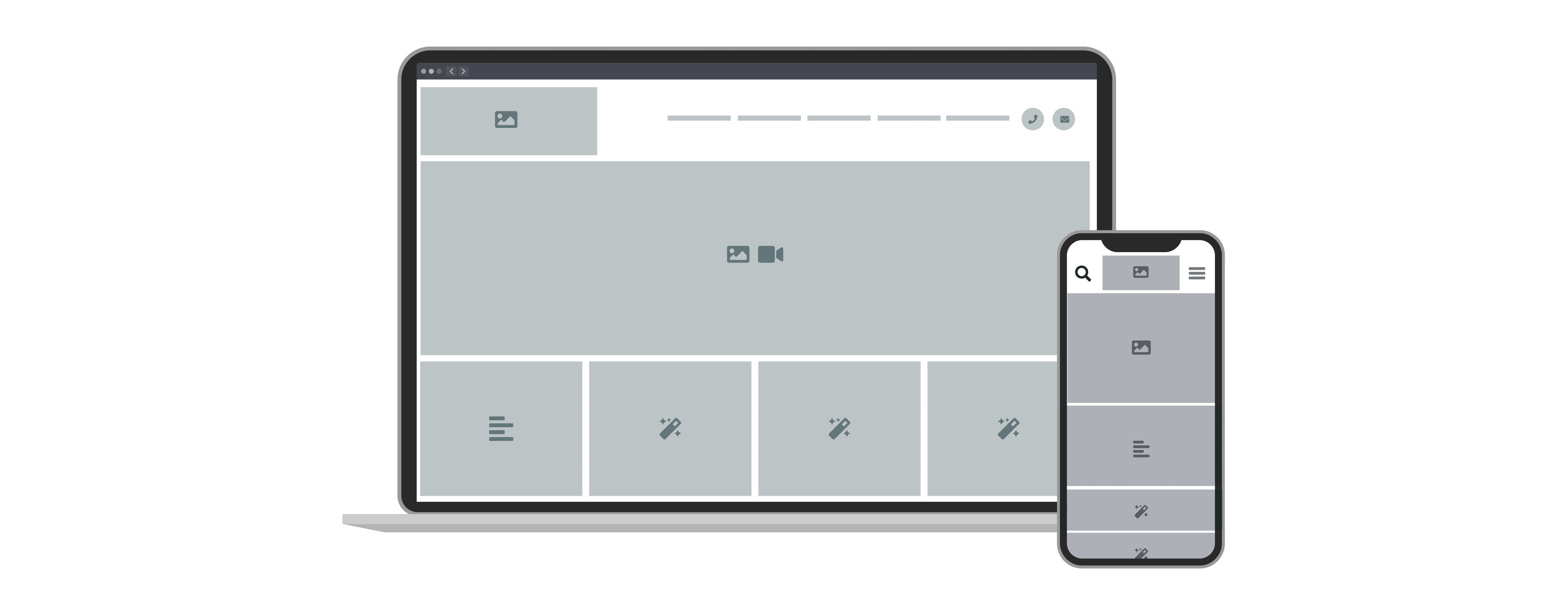
Keen Eye for Detail
Keep an eye on the smaller details, these are often the little niggles that can frustrate users. For examples button size, the button may be the perfect size for your tiny on-screen curser, but does it fit your finger when reduced to a smaller mobile device?
Another one of my major bug bears is imagery! Imagery is one of the most important aspects to any website because it is this that visitors will form an opinion on. Quality over quantity! However, quality doesn’t just mean if something is in focus or not. Think about the composition, there needs to be plenty of space around the focal point of the photo to not only draw attention but also not chop anything important off. All marketing platforms require different shapes and sizes so keeping that empty space allows for a bit of breathing room.
Smart phone cameras are getting better and better and for most, the photo resolution is phenomenal. Ensure the imagery is not blurred by holding the device as still as possible and avoid lots of movement in the background. And my top tip…take as many photos as you can! There is no such thing as too many!

Keep It Simple
0.05 seconds is the time it takes a visitor to form an opinion about your website, so it is vitally important that the structure and navigation is easy to follow to increase chances of conversion e.g., buy a product, get in touch, subscribe to a newsletter. If a website is difficult to use and frustrating for a visitor, they will simply leave the site and find another website that does the same job better. It is that simple.
However, it isn’t just the visitors you need to please, search engines such as Google are now so advanced, if it is appealing to users, then it is appealing to search engines. Search engines crawl websites in the same way a user will navigate through websites, so the faster it can be crawled the quicker it can be ranked. The same idea applies to the responsive nature of a website. The mobile version should work just as well as the desktop.
Key areas to consider when creating or improving your site structure:
Who are you target audience?
What is the purpose of the website?
What search terms do you rank for?
Organise pages into sub-pages
Keep it simple!
Led Down the Right Path
Writing the perfect call to action can often make or break your website. Too pushy it could look spammy and scare off any potential customers. Too weak and it just isn’t doing its job. A CTA’s purpose is to encourage visitors to navigate through the website, providing shortcuts and signposts to different areas of the website. The call to action is one of the few aspects of a website that will directly impact conversion rates.
To create a good call to action it needs to be persuasive, use strong action words, give a sense of urgency as well as pop off the page visually. Scattering multiple CTAs throughout the webpages will increase chances of click through.
Prove It
I speak to a lot of business owners that are brilliant at what they do and want to shout about every detail! But do you need to? Do your customers care about all the techy jargon? Or do they just need a business who will sort it all for them? By fully understanding what your customers want to know, this will help you include only the relevant information without overloading your website.
Include the right level of information that is understandable for your target audience
Build confidence by proving you can do the job through case studies and reviews
Keep it fresh and up to date to show consistency in the level of service your providing
To Wrap It Up
To summarise to improve conversion rates make sure you know exactly how you want your brand to look and feel. Understand your audience so you know the information that needs to be included on your website. An easy-to-follow structure and strong call to actions will guide visitors through a clear user journey. And build confidence on their way by showing off your good bits through case studies and reviews.
But remember your website is never finished!