What Should Be Included In Brand Guidelines?
Your brand isn’t just a logo. It’s the feeling people get when they come across your business, the colours they associate with you and the consistency that builds trust over time.
Written by: Jess, Lead Creative
23/03/2026
6 min read

None of that happens by accident. It happens because there’s a clear, documented set of rules guiding every decision and that document is your brand guidelines.
Think of brand guidelines as an operating manual for your brand. Brand guidelines can be used by anyone working with you, whether that’s your internal team, a freelancer, or a marketing agency. They’re the single source of truth for anyone who creates a social graphic, adds your logo to a document, or writes copy in your brand’s voice. Here’s what every solid set of brand guidelines should include.
How Detailed Should Your Brand Guidelines Be?
There’s no single right answer here and it’s a question worth addressing before you dive in. A one-page brand summary and a 40-page brand document are both valid depending on the size of your business, the number of people working with your brand and how many channels you’re active across.
For smaller businesses or those just starting out, a concise document covering the essentials, logo, colours, fonts and tone, is enough to create meaningful consistency. As your business grows, your team expands, or your marketing activity scales up, your guidelines can grow with you. A good rule of thumb is to aim for something that takes no longer than ten to fifteen minutes to read in full. A document that’s too long simply won’t be followed closely enough to be useful.
The important thing isn’t how long the guidelines are, but how clearly they communicate the rules and how consistently those rules are applied. A simple, well-followed document will always outperform a detailed one that nobody reads.
Logo Usage Rules and File Formats
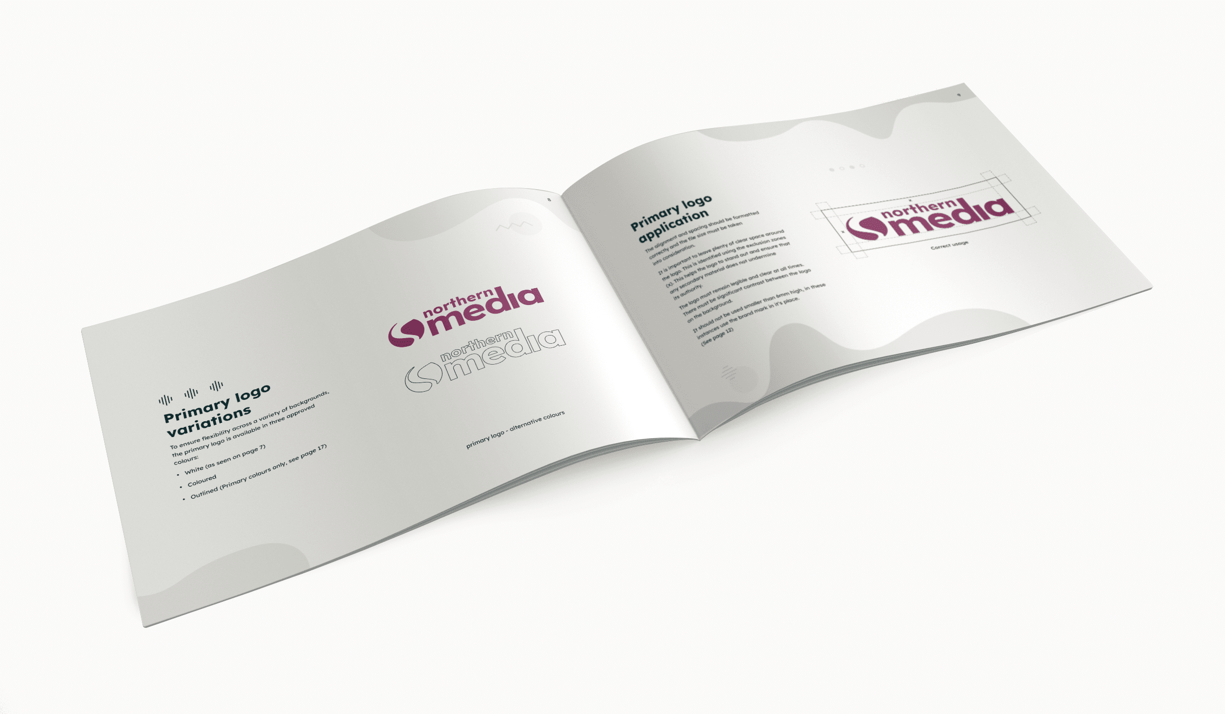
The logo is the most visible element of your brand, but simply having one isn’t enough. Your guidelines need to define exactly how it should and shouldn’t be used.
This means covering logo variations, for example a full colour version, a white version, a dark version and potentially a simplified icon-only mark, as well as how each should be applied across different contexts. A logo that looks great on a white background can become impossible to read when placed over a dark image. Your guidelines should address this clearly.
Do’s and Don’ts
Correct usage rules should be specific and practical. Rather than vague guidance, use direct Do’s and Don’ts that leave no room for misinterpretation. This includes:
- Do not stretch, warp, or alter the logo’s proportions under any circumstances
- Do not add effects such as drop shadows, outlines, or gradients to the logo
- Do not place the logo on a background colour that creates low contrast or clashes with the palette
This is particularly valuable for non-designers who might not fully understand abstract rules but can immediately recognise when something looks wrong when shown a side-by-side example. It also removes any ambiguity around rules that could otherwise be interpreted in more than one way.
Sizing and Safe Zones
Your guidelines should also specify minimum sizing, for example the smallest the logo should appear in print or on screen and the safe zone, which is the clear space that must always surround it before any other element appears. This prevents the logo from feeling crowded or losing impact.
Asset Library and File Formats
Specifying which file format to use in which environment removes a lot of guesswork, particularly for non-designers. SVG files are best for websites and digital use because they scale without losing quality. EPS files are the standard for print. PNG files with a transparent background work well for general use in documents and presentations. Having these clearly labelled in an accessible asset library means anyone working with your brand can grab the right file for the right job without having to ask.
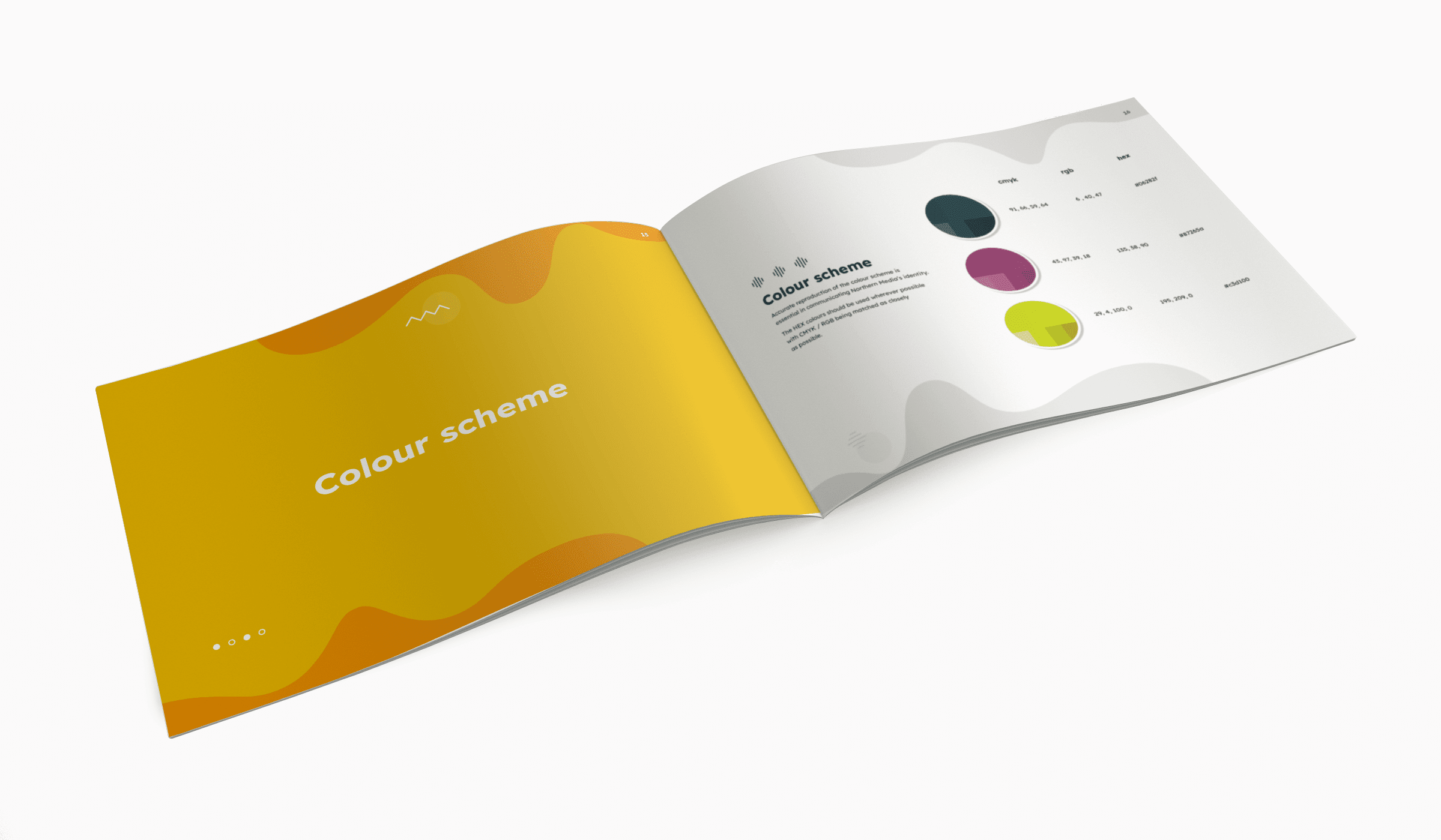
Brand Colours and Colour Palette Variations
Colour is one of the most powerful tools in branding. The right palette can communicate your brand’s personality before a single word is read and research consistently shows it has a significant impact on recognition.
Your guidelines should define your full colour palette clearly, including:
- Primary colours (the dominant colours used across all materials)
- Secondary and accent colours (used to support the primary palette)
- Colour palette variations for both digital and print use
This last point matters more than people realise. Every colour in the palette needs to be specified in three formats: HEX codes for digital and web use, RGB values for screen-based work and CMYK values for print. Without all three, your colours can look entirely different depending on where they appear. It’s something we explore in detail in Why Consistency Is Important Across Digital and Print Platforms and your colour specifications sit right at the heart of it.
Typography and Font Style
Fonts carry far more weight than most people give them credit for. A bold geometric sans-serif communicates something completely different to an elegant serif and inconsistent font usage across your content makes your brand feel disjointed and unpolished.
Your typography section should cover which fonts you use, the hierarchy for applying them (headings, subheadings, body copy, CTAs) and the specific sizing and weight rules to follow. If you use a primary brand font for headings and a complementary font for body text, both need to be documented clearly. For businesses without access to paid fonts, approved free alternatives should also be listed so no one’s left improvising. It’s worth remembering that typography guidance will be used by non-designers too, so include practical examples of how fonts should appear in everyday materials like email signatures, presentations and letterheads, not just in polished design templates.
Photography Style and Why Stock Imagery Falls Short
If your brand uses photography or custom imagery, the visual style needs to be defined just as clearly as your colours or logo. Imagery that’s warm, natural and human tells a completely different story to imagery that’s cold or heavily edited and mixing styles across your channels makes your brand feel fragmented.
One of the most common mistakes in brand guidelines is failing to address stock photography properly. If every business in your sector is pulling from the same stock libraries, your brand will look indistinguishable from your competitors. Your guidelines should actively steer away from generic stock imagery and instead define a distinctive photographic style that’s uniquely yours. That might be high contrast, gritty editorial photography, bright and colourful lifestyle imagery, or something else entirely, but it should be yours. Where possible, brand elements like your colour palette or logo should appear within the imagery itself to reinforce recognition.
This feeds directly into how your social presence looks and performs as a whole. It’s one of the key factors we cover in 5 Ways To Improve The Look Of Your Social Media and if you want to see what a cohesive visual identity can do for a brand in practice, our Excel Roller Shutters case study is a great example of it in action.
Icons and Additional Graphic Elements
Beyond the core visual elements, many brands use a supporting system of icons, patterns, textures, or graphic shapes as part of the wider identity. These might appear on presentations, website navigation, social templates, or printed materials.
Where relevant, your guidelines should define which icons you use and from which set, how they should be sized and styled and where additional graphic elements can and can’t be applied. As with logo usage, be specific rather than abstract. Rather than saying graphic elements should feel balanced, explain precisely where they can appear, at what scale and what they should never do, such as overlapping the logo, competing with the primary headline, or being used at inconsistent sizes across different materials.
The goal is for every supporting element to feel like it belongs to the same visual family. When it’s all pulled together properly, your brand feels cohesive and that consistency builds recognition and trust without your audience even realising why.
Social Media Brand Guidelines
Your brand guidelines should extend to how your brand shows up on social media specifically, not just in terms of tone and imagery, but in terms of practical formatting. Profile image specs, cover photo dimensions, post template styles and the fonts or colours used in graphics all need to be considered.
It’s also worth thinking about how your brand behaves on social, not just how it looks. How do you respond to comments? What kind of content do you share versus create? How often do you post and does the frequency feel consistent with the brand you’re building? These are the kinds of questions your guidelines should answer, because social media is often the first place a potential customer encounters your brand and that first impression matters enormously.
Different platforms have different audiences and expectations. The way your brand shows up on LinkedIn will naturally differ from how it appears on Instagram, but the core identity, the colours, fonts, tone and values, should remain unmistakably yours across all of them. Whether you’re running a B2B strategy or a broader content plan, consistency is what makes the difference. Our B2B Social Media Marketing Guide goes into this in more detail and the results we achieved through Driving Growth with LinkedIn and Content Marketing are a clear example of what a well-branded, consistent social presence can deliver.
Who Needs Access to Your Brand Guidelines?
Once created, your guidelines are only as valuable as their reach. They should be shared with your internal team, any designers or agencies working with you and freelancers producing content on your behalf.
It’s also important that the document is written in a way that non-designers can follow without difficulty. Employees using branded templates, creating presentations, or writing emails are just as much a part of your brand consistency as your design team and your guidelines need to speak to them too. A single, up-to-date document that everyone references removes the guesswork and the inconsistency that builds up when different people make different assumptions. Whether someone’s working on your website design, building out a campaign, or running a multi-channel digital strategy on your behalf, they should all be working from the same rulebook.
Avoiding the Trap of Over-Restriction
There’s a balance to strike in brand guidelines that’s easy to get wrong. Rules that are too rigid can actually work against you. If your guidelines state that the logo can only ever appear in the top left corner of a design, there will eventually be a situation where that rule needs to be broken and with no flexibility built in, it creates confusion rather than clarity.
A more useful approach is to explain the principle behind the rule. Rather than “logo top left only,” explain that the logo needs to be positioned in a way that gives it the visual weight it needs within the overall design. That gives whoever’s working with your brand enough structure to make the right call in any situation, rather than feeling stuck the moment they encounter something your guidelines didn’t anticipate.
Keeping Your Brand Guidelines Up to Date
Creating your brand guidelines isn’t a one-time task. As your business evolves, your visual identity, the platforms you use and the audiences you speak to will shift and your guidelines need to reflect that.
It’s worth reviewing your guidelines at least once a year, or whenever you go through a significant change such as a rebrand, a new product launch, or a shift in your target audience. If your guidelines still reference platforms you no longer use, fonts you’ve moved away from, or a brand voice that no longer reflects where your business is, they stop being a useful tool and start creating confusion. Keeping them current is just as important as having them in the first place.
What Happens Without Brand Guidelines
Without clear guidelines, the same brand can look and feel entirely different depending on who’s producing the content. Logos get stretched, colours shift, fonts get substituted and tone varies wildly. Over time this erodes trust and makes it much harder for your audience to build a clear picture of who you are.
Inconsistency doesn’t just look unprofessional. It actively works against your marketing efforts. If someone encounters your brand across multiple channels and it doesn’t feel cohesive, they’re far less likely to remember you, trust you, or choose you.
Brand guidelines are the foundation that everything else is built on. From your logo and colour scheme to your typography, photography style and brand voice, a clearly documented set of rules ensures your brand looks, sounds and feels consistent no matter where it shows up. The businesses that invest in getting this right early are the ones whose brands grow stronger with every campaign, every platform and every piece of content.
If you’re ready to build a brand identity that truly works for your business, Northern Media can help. From brand guideline creation to full digital marketing strategy, we work with businesses across the UK to build brands that are consistent, credible and built to grow. Get in touch with the team today to find out how we can help.
